Sunday, 25 March 2012

First contents page photo shoot

Take 1
Take 2
Take 3
Take 4
Take 5
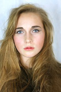
The photographs above are inspired by this photograph of a well known female singer Kelly Clarkson,I took the pose in the right hand side rather than in the original way left hand side because I felt that my model looked more engaged and I felt that the singer in the original photograph looked like she was leaning too far back and looked like she was about to fall.I also straightened my models hair because on my front cover her  hair was tasselled and slightly wavy so I wanted to show variation in the way that I presented my model.I took these photographs in a studio so the lighting quality is fairly good  and I used a digital SLR camera so the quality of the photograph is also reasonably good.I have decided to use take 1 because I feel that my model captures  the right presence that I want for my music magazine she  represents fun,confidence she also  looks stylish  and  edgy in this photograph. 
As you cans  from the print screen featured above I took a large amount of photographs experimenting with a few poses within the concept of composition that I already had do that I was able to a good quality result  the first time because of my organisation  I  avoided having to repeatedly  re shoot.

Take 2

Take 2

Take 3
The following three takes above are the best of the photographs that I took of my model are the best out of a ll the photographs I took.These poses ans styling  of my model is based  on the photographs featured below of young teenage star Willow Smith.However,because my model is slightly shy  she was unable to deliver the same level of confidence, sass and attitude that Willow smith possesses  in her photographs.In the photographs my model is also disconnected from the  camera and is not looking directly into the camera she is also stiffly posing as  her posing looks second guessed and awkward.


Take 1 pose 1

Take 2 pose 1

Take2 pose 1

Take 4 pose 1

Take 5 pose 1

Take 7 pose 1

Take 1 pose 2

Take 2 pose 3

Take 2 pose 4 
The following photographs of my model  both pose  1 and pose 2 are inspired from this photograph of well known young singer Hilary Duff and singer below Mandy Moore.I have chosen to use take 7 pose 1 because I feel that my model looks relaxed engaged  and confident yet slightly cheeky and fun.I feel that this photograph is beautiful because the pose and composition  is not too complicated it is merely classic and simple,my model is merely looking directly into the camera and smiling and I feel this works well; occasionally simplicity is the best key.
 

As you cans see from the print screen above I took a lot of photographs which enabled me to have  more to choose from which also guaranteed me a good photograph because my concept was focused and fully explored. I also took the photographs in a studio so the lighting in my photographs fairly good I also used a digital SLR camera to take my photographs which enabled the quality of  of my pictograph to be very good.

Monday, 19 March 2012

Intial contents page reserch


What I have learnt form my contents page research(my conclusion):
  • The colours of my masthead must relate tot he colour scheme used throughout my contents page
  • The typeface used must be sans serif so that it is clear and easy to read by a vast majority of the general public
  • Must masthead must be featured on my contents page
  •  Te bottom  of the page should feature :the date,  the  issue number and   the magazines web address 
  • The largest photograph on my contents page  must relate to the photograph used for my front cover
  • The contents table must have a structured set layout,the contents  page  must be divided into categories  and a heading and page number is able to identify each category,Page numbers must be featured on the photographs which anchors tot he written contents
  • The photography sued must be interetsing and varied


Sunday, 18 March 2012

Final version of front cover

This  is my final front cover design!!!!!!!!!!!!!!


How I made my front page proof


 Firstly,I began by manipulating my photograph by using photo shop in order to improve the quality of my photograph by airbrushing my photograph which is a conclusion that my photograph research has showed me.
 Consider the example above to the left is an un-airbrushed photograph taken of Adele on the red carpet her face it slightly rounder and fuller,her complexion is slightly uneven and her  hair colour has less vibrancy.On the  magazine cover to the right Adele's hair is very vibrant,her complexion is much more even, her eye colour appears brighter and shiner and her face is less rounded as her face  appears much more angular.
Above all, airbrushing the photograph enhances the beauty of the photograph since the models imperfections and blemishes are removed,I applied the technique of airbrushing by using adobe Photoshop.
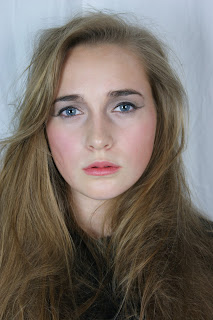
Original 
photograph
Airbrushed 
photograph

A detailed account of how I manipulated my photograph will be included in my evaluation  for question 6. 
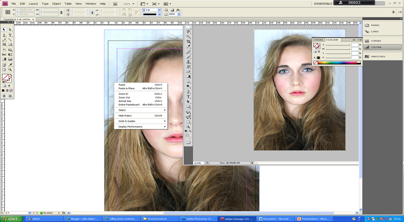


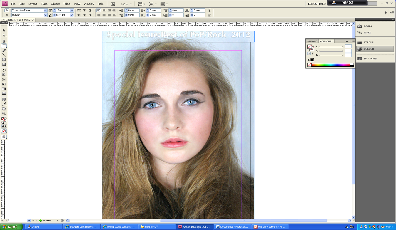
After manipulating the photograph I then  copied and paste the photograph into in design in order to begin designing my music magazine.

I then began typing the skyline and used font :ZapfHumnst Ult BT.
I applied  the stroke tool to the font in order to change the font white and outline it black, as I had planned.


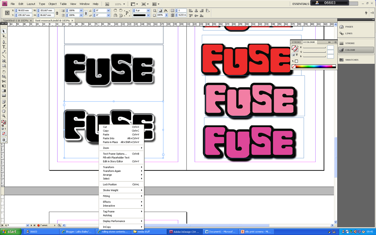
I then imported my chosen masthead from one in design document to the one I was currently using for my magazine front cover.
I used the font spacing  tool in order to increase the letters between  each letter in my masthead in order to make sure that the masthead was aligned with  the skyline.
I then typed the main cover line using the font veranda,I then used the stroke tool in order to change the colour of the font to white.


I copied and paste a bar code form google as you can see from  the print screen above I then imported it into in design  so that I could use it for my magazine front cover,as is clearly seen in the print screen below.


I then began typing the cover line using the typeface veranda the same font that I used for my main cover-line.
I then used the stroke tool in order to add a black outline to the font and then went to object effect in order to add drop shadow.
I then used the slant font tool in order slant the article name so that it was defined against the rest of the cover line,my research front cover enabled me to draw to that conclusion.

In order to adjust the final touches of my magazine cover I did the following steps:


 I then used the healing brush in order to   remove a piece of hair form her face, that I had previously left but felt looking back had looked weird.
As you can see form the print screen above I found out  the canvas size of photograph,on adobe Photoshop  and applied this to the page size of my front cover on
in-design  so that my photograph would properly fit.
I then copied an paste all the font from my previous magazine document and transferred it into the new one.