Sunday, 25 March 2012

First contents page photo shoot

Take 1
Take 2
Take 3
Take 4
Take 5
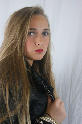
The photographs above are inspired by this photograph of a well known female singer Kelly Clarkson,I took the pose in the right hand side rather than in the original way left hand side because I felt that my model looked more engaged and I felt that the singer in the original photograph looked like she was leaning too far back and looked like she was about to fall.I also straightened my models hair because on my front cover her  hair was tasselled and slightly wavy so I wanted to show variation in the way that I presented my model.I took these photographs in a studio so the lighting quality is fairly good  and I used a digital SLR camera so the quality of the photograph is also reasonably good.I have decided to use take 1 because I feel that my model captures  the right presence that I want for my music magazine she  represents fun,confidence she also  looks stylish  and  edgy in this photograph. 
As you cans  from the print screen featured above I took a large amount of photographs experimenting with a few poses within the concept of composition that I already had do that I was able to a good quality result  the first time because of my organisation  I  avoided having to repeatedly  re shoot.

Take 2

Take 2

Take 3
The following three takes above are the best of the photographs that I took of my model are the best out of a ll the photographs I took.These poses ans styling  of my model is based  on the photographs featured below of young teenage star Willow Smith.However,because my model is slightly shy  she was unable to deliver the same level of confidence, sass and attitude that Willow smith possesses  in her photographs.In the photographs my model is also disconnected from the  camera and is not looking directly into the camera she is also stiffly posing as  her posing looks second guessed and awkward.


Take 1 pose 1

Take 2 pose 1

Take2 pose 1

Take 4 pose 1

Take 5 pose 1

Take 7 pose 1

Take 1 pose 2

Take 2 pose 3

Take 2 pose 4 
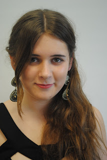
The following photographs of my model  both pose  1 and pose 2 are inspired from this photograph of well known young singer Hilary Duff and singer below Mandy Moore.I have chosen to use take 7 pose 1 because I feel that my model looks relaxed engaged  and confident yet slightly cheeky and fun.I feel that this photograph is beautiful because the pose and composition  is not too complicated it is merely classic and simple,my model is merely looking directly into the camera and smiling and I feel this works well; occasionally simplicity is the best key.
 

As you cans see from the print screen above I took a lot of photographs which enabled me to have  more to choose from which also guaranteed me a good photograph because my concept was focused and fully explored. I also took the photographs in a studio so the lighting in my photographs fairly good I also used a digital SLR camera to take my photographs which enabled the quality of  of my pictograph to be very good.

No comments:

Post a Comment