Firstly,I began by manipulating my photograph by using photo shop in order to improve the quality of my photograph by airbrushing my photograph which is a conclusion that my photograph research has showed me.
Consider the example above to the left is an un-airbrushed photograph taken of Adele on the red carpet her face it slightly rounder and fuller,her complexion is slightly uneven and her hair colour has less vibrancy.On the magazine cover to the right Adele's hair is very vibrant,her complexion is much more even, her eye colour appears brighter and shiner and her face is less rounded as her face appears much more angular.
Above all, airbrushing the photograph enhances the beauty of the photograph since the models imperfections and blemishes are removed,I applied the technique of airbrushing by using adobe Photoshop.
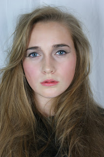 |
| Original |
photograph
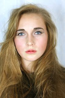 |
| Airbrushed |
photograph
A detailed account of how I manipulated my photograph will be included in my evaluation for question 6.
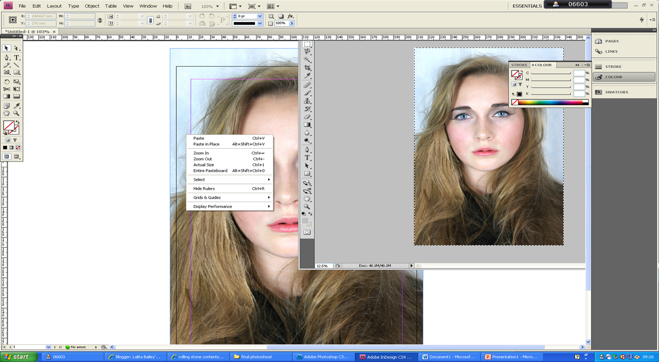 |
| After manipulating the photograph I then copied and paste the photograph into in design in order to begin designing my music magazine. |
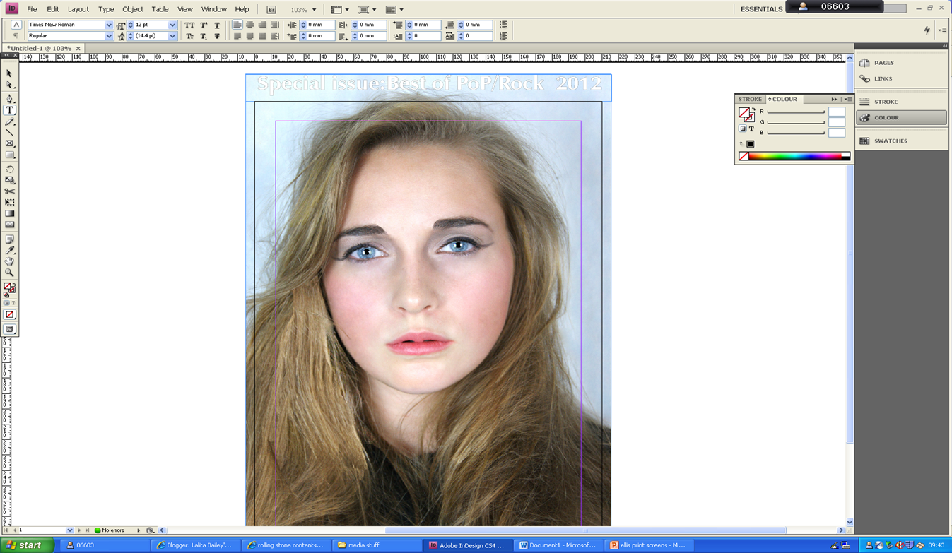 |
I then began typing the skyline and used font :ZapfHumnst Ult BT.
I applied the stroke tool to the font in order to change the font white and outline it black, as I had planned.
|
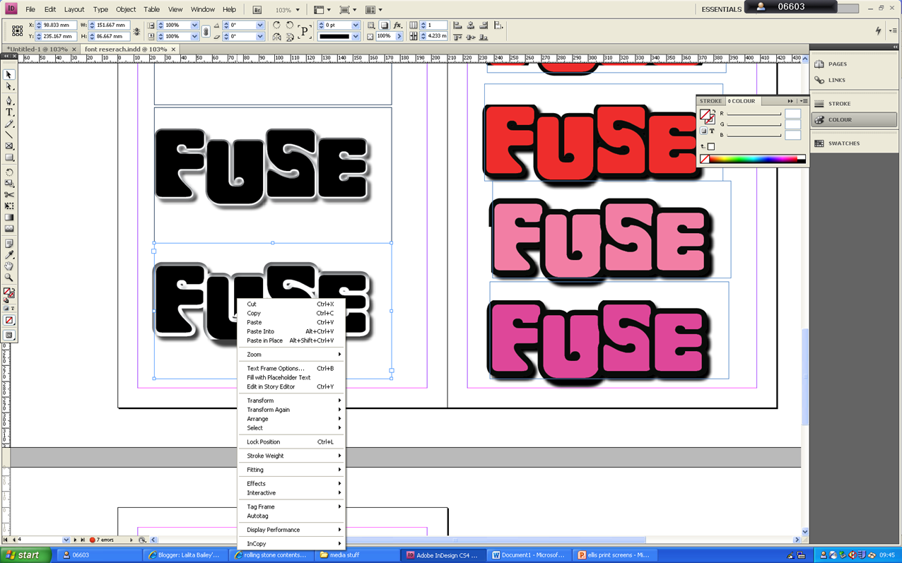 |
I then imported my chosen masthead from one in design document to the one I was currently using for my magazine front cover.
I used the font spacing tool in order to increase the letters between each letter in my masthead in order to make sure that the masthead was aligned with the skyline.
I then typed the main cover line using the font veranda,I then used the stroke tool in order to change the colour of the font to white.
I copied and paste a bar code form google as you can see from the print screen above I then imported it into in design so that I could use it for my magazine front cover,as is clearly seen in the print screen below.
I then began typing the cover line using the typeface veranda the same font that I used for my main cover-line.
I then used the stroke tool in order to add a black outline to the font and then went to object effect in order to add drop shadow.
I then used the slant font tool in order slant the article name so that it was defined against the rest of the cover line,my research front cover enabled me to draw to that conclusion.
In order to adjust the final touches of my magazine cover I did the following steps:
I then used the healing brush in order to remove a piece of hair form her face, that I had previously left but felt looking back had looked weird.
As you can see form the print screen above I found out the canvas size of photograph,on adobe Photoshop and applied this to the page size of my front cover on
in-design so that my photograph would properly fit.
I then copied an paste all the font from my previous magazine document and transferred it into the new one.
|


No comments:
Post a Comment