Sunday, 25 March 2012

specific double page spread research


This along with the research above are the basis for my inspiration I like the idea of incorporating over sized font onto my double page I think it looks slick,stylish and sophisticated this is elements which I wish to incorporate as part of my magazine,above are preliminary drawings based on these ideas.

Double page spread photo shoot 1


Take1 pose1
Take 2 pose 1
Take3 pose 1
Take 4 pose 1
Take 5 pose 1


Take 6 pose 1
Hilary Duff - 2006 Brian Bowen Smith Photoshoot For Seventeen Magazine, October Issue
Photograph research/inspiration
I have chosen  to use take 6 pose 1.I have chosen this photograph because I feel that my model here radiates confidence sass and style.

Detailed contents page research


Photograph research/inspiration 
This photograph is to be used  as the main photograph on the contents page the same model  is used which relates to the magazine cover,therefore relating to main article.The model's  styling(hair,clothes and makeup) definitely relates to  my research.


Photograph research/inspiration(for my photograph below)
This photograph is to be featured in my contents table as the highlighted feature article.
Photograph research/inspiration(to the right)
This photograph is to be featured beneath the main article  photograph  and is going to be the second largest photograph on the page.
This is a sketch of my final contents page design  that I will use.


Initial double page spread research


Specific contents page research


The contents pages to the left have inspired these  the preliminary content page drawings below. I have been inspired by these contents page designs  because I feel that there design is slick and organised  I also feel like it is original and  by incorporating aspects of these contents pages will truly relate to the theme of what I am trying to convey  throughout my magazine  a slick and sophisticated original idea  and yet girly and fun.


Second Contents page photoshoot


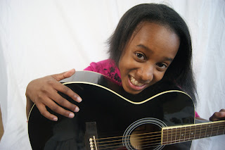
This photograph and the one above are of famous YouTube singing sensation Gabi Wilson ,I decided to reevaluate the  photographs and  I was using to inspire my own because this suits my model's  personality more .The singer looks cheeky, cute an playful which is why I felt like  it would it be much more  well suited in comparison to the photograph inspiration of a bold and overly  confident Willow Smith.
Take 1 pose 1
Take 2 pose 1

Take 3 pose 1

Take 4 pose 1

Take 1 pose 2


Take 2 pose 2 

Take3 pose 2

Take 4 pose 2

I have chosen to use take 1pose 2 because my model looks relaxed ,she looks like she is enjoying  herself  and having fun ,she also looks cute and engaging  and I believe this definitely suits what I want for  my magazine.
I was able to get a good selection of photographs second time round when I was focused and developed my ideas by taking similar shots by adjusting the pose,styling and composition slightly,as you can see from the  print screens used above.

First contents page photo shoot

Take 1
Take 2
Take 3
Take 4
Take 5
The photographs above are inspired by this photograph of a well known female singer Kelly Clarkson,I took the pose in the right hand side rather than in the original way left hand side because I felt that my model looked more engaged and I felt that the singer in the original photograph looked like she was leaning too far back and looked like she was about to fall.I also straightened my models hair because on my front cover her  hair was tasselled and slightly wavy so I wanted to show variation in the way that I presented my model.I took these photographs in a studio so the lighting quality is fairly good  and I used a digital SLR camera so the quality of the photograph is also reasonably good.I have decided to use take 1 because I feel that my model captures  the right presence that I want for my music magazine she  represents fun,confidence she also  looks stylish  and  edgy in this photograph. 
As you cans  from the print screen featured above I took a large amount of photographs experimenting with a few poses within the concept of composition that I already had do that I was able to a good quality result  the first time because of my organisation  I  avoided having to repeatedly  re shoot.

Take 2

Take 2

Take 3
The following three takes above are the best of the photographs that I took of my model are the best out of a ll the photographs I took.These poses ans styling  of my model is based  on the photographs featured below of young teenage star Willow Smith.However,because my model is slightly shy  she was unable to deliver the same level of confidence, sass and attitude that Willow smith possesses  in her photographs.In the photographs my model is also disconnected from the  camera and is not looking directly into the camera she is also stiffly posing as  her posing looks second guessed and awkward.


Take 1 pose 1

Take 2 pose 1

Take2 pose 1

Take 4 pose 1

Take 5 pose 1

Take 7 pose 1

Take 1 pose 2

Take 2 pose 3

Take 2 pose 4 
The following photographs of my model  both pose  1 and pose 2 are inspired from this photograph of well known young singer Hilary Duff and singer below Mandy Moore.I have chosen to use take 7 pose 1 because I feel that my model looks relaxed engaged  and confident yet slightly cheeky and fun.I feel that this photograph is beautiful because the pose and composition  is not too complicated it is merely classic and simple,my model is merely looking directly into the camera and smiling and I feel this works well; occasionally simplicity is the best key.
 

As you cans see from the print screen above I took a lot of photographs which enabled me to have  more to choose from which also guaranteed me a good photograph because my concept was focused and fully explored. I also took the photographs in a studio so the lighting in my photographs fairly good I also used a digital SLR camera to take my photographs which enabled the quality of  of my pictograph to be very good.