Monday, 19 March 2012

Intial contents page reserch


What I have learnt form my contents page research(my conclusion):
  • The colours of my masthead must relate tot he colour scheme used throughout my contents page
  • The typeface used must be sans serif so that it is clear and easy to read by a vast majority of the general public
  • Must masthead must be featured on my contents page
  •  Te bottom  of the page should feature :the date,  the  issue number and   the magazines web address 
  • The largest photograph on my contents page  must relate to the photograph used for my front cover
  • The contents table must have a structured set layout,the contents  page  must be divided into categories  and a heading and page number is able to identify each category,Page numbers must be featured on the photographs which anchors tot he written contents
  • The photography sued must be interetsing and varied


Sunday, 18 March 2012

Final version of front cover

This  is my final front cover design!!!!!!!!!!!!!!


How I made my front page proof


 Firstly,I began by manipulating my photograph by using photo shop in order to improve the quality of my photograph by airbrushing my photograph which is a conclusion that my photograph research has showed me.
 Consider the example above to the left is an un-airbrushed photograph taken of Adele on the red carpet her face it slightly rounder and fuller,her complexion is slightly uneven and her  hair colour has less vibrancy.On the  magazine cover to the right Adele's hair is very vibrant,her complexion is much more even, her eye colour appears brighter and shiner and her face is less rounded as her face  appears much more angular.
Above all, airbrushing the photograph enhances the beauty of the photograph since the models imperfections and blemishes are removed,I applied the technique of airbrushing by using adobe Photoshop.

Original 
photograph
Airbrushed 
photograph

A detailed account of how I manipulated my photograph will be included in my evaluation  for question 6. 


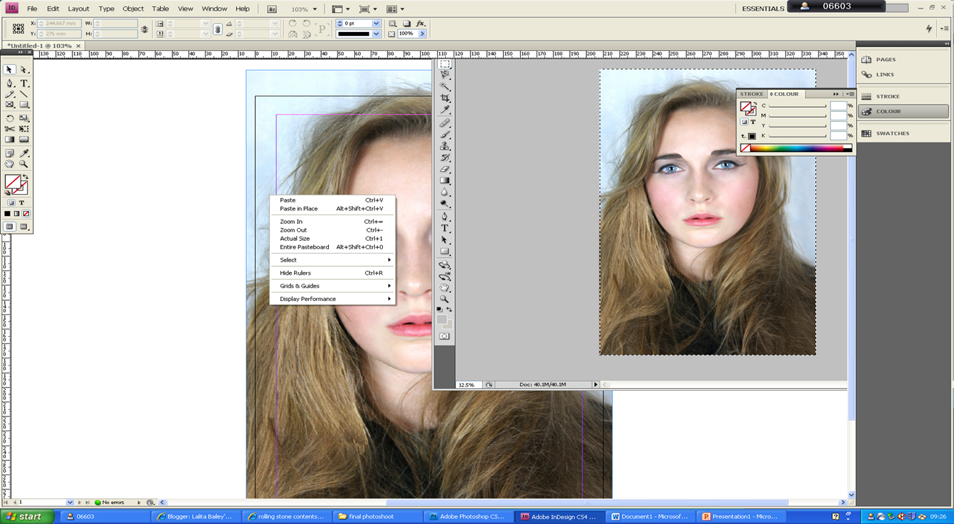
After manipulating the photograph I then  copied and paste the photograph into in design in order to begin designing my music magazine.

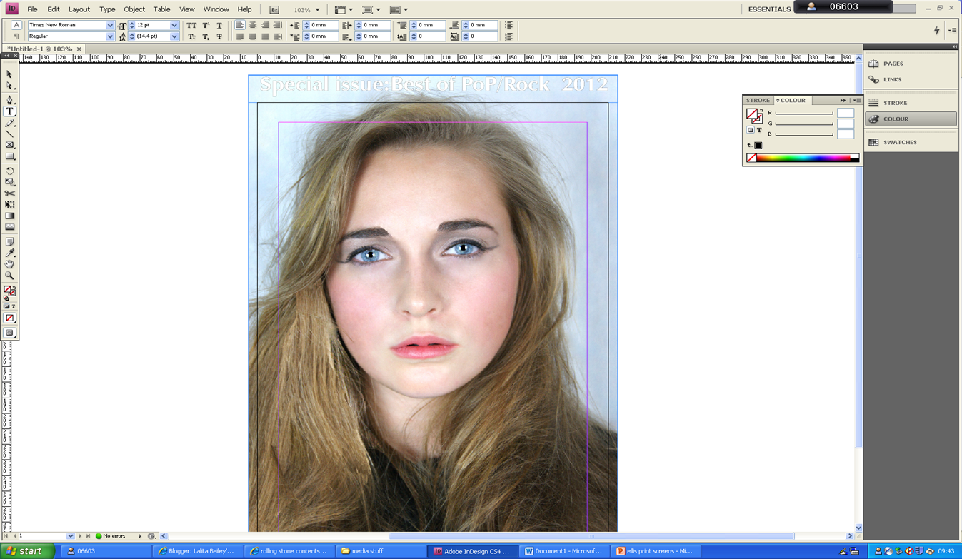
I then began typing the skyline and used font :ZapfHumnst Ult BT.
I applied  the stroke tool to the font in order to change the font white and outline it black, as I had planned.


I then imported my chosen masthead from one in design document to the one I was currently using for my magazine front cover.
I used the font spacing  tool in order to increase the letters between  each letter in my masthead in order to make sure that the masthead was aligned with  the skyline.
I then typed the main cover line using the font veranda,I then used the stroke tool in order to change the colour of the font to white.


I copied and paste a bar code form google as you can see from  the print screen above I then imported it into in design  so that I could use it for my magazine front cover,as is clearly seen in the print screen below.


I then began typing the cover line using the typeface veranda the same font that I used for my main cover-line.
I then used the stroke tool in order to add a black outline to the font and then went to object effect in order to add drop shadow.
I then used the slant font tool in order slant the article name so that it was defined against the rest of the cover line,my research front cover enabled me to draw to that conclusion.

In order to adjust the final touches of my magazine cover I did the following steps:


 I then used the healing brush in order to   remove a piece of hair form her face, that I had previously left but felt looking back had looked weird.
As you can see form the print screen above I found out  the canvas size of photograph,on adobe Photoshop  and applied this to the page size of my front cover on
in-design  so that my photograph would properly fit.
I then copied an paste all the font from my previous magazine document and transferred it into the new one.
    

Monday, 5 March 2012

Early verison of front page

Looking back I have realised that I have  made my magazine cover outside the margin guide lines  and now I have to re-size the magazine cover so that all my magazine cover can be seen,I also need to make sure that all all the cover lines are in line I also need to improve the display performance of my photograph because it loses picture quality when it is imported in to adobe In Design.

Monday, 20 February 2012

Font research


I chose the name fuse because I felt that it sounded dynamic catchy and a title for a magazine that I felt would be easy to remember and I also it represented the kind of magazine I am trying to achieve a music magazine designed for women that 'fuses' together both music with topics that women care about like  fashion,beauty etc.


In the first font idea I gave the font a basic  thick outline and coloured it white as this is a neutral colour that would appeal to all kinds of women however I felt like the font was lacking  a bit of energy.


With the second font idea  I gave it  a  blue outline and coloured the font black I also underline tool and cross out text tool in order  to give the font more energy and also more character.However I felt that this font idea looked very robotic and unattractive.


I  then changed the font to yellow  because I though that this would be a much more feminine colour and I also underlined  yellow because I felt that this would give the font dimension.Unfortunately,I do not like this because it is  too bright  so with the next font idea I lightened the shade of yellow but I feel that the shade of yellow of the font  just does not look good the underline of the font is also jagged which by looking back  looks ridiculous.


I then changed the font  red  and re- straightened the underline  the outline is also navy blue which are colours that compliment one another  but I still do not like this.

I then changed the colour of the text  to a khaki green I then paired this colour with a neon blue outline  I then used  the pen tool in order to make the font look as if its descending  but I felt like this looked tacky and unprofessional.


With all these font ideas I experimented with different colours different outline thicknesses and colours and in the end I  came to the conclusion that this font was not very feminine  at all it is very solid in structure an looks very militant I do not like  Ultra Serif SF at all.


I then used the font
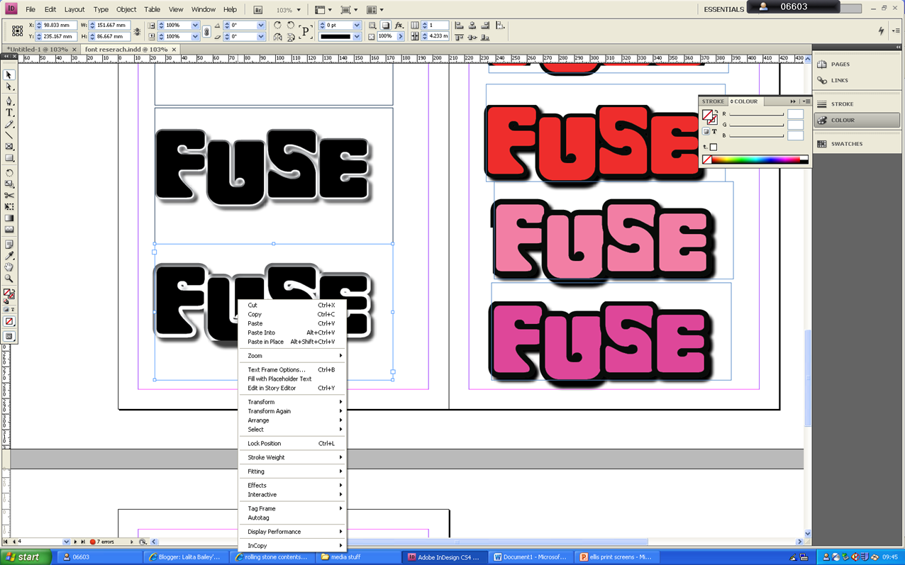
Woodchuck SF and I found that I really liked it I experimented with other fonts  such as inner and outer shadow in order to give it dimension I also stuck with the black font outlined white outline because I felt that the colours complimented with one another black and white are also very neutral colours which would definitely appeal to my target audience and come across as elegant which is a message that I also want to convey.The font is bubble writing type form which connotes the bold poppy and happy feel that I want to convey it is also clear,bold and easy to read.
 

Again I used the same font but I increased the shadow and  thickened a black outline I also used different shades of pink and red  but I unfortunately felt that it looked too girly and lost its elegant sassy   feel  that the previous font Ideas had.


I have chosen to use this font idea for the masthead of my magazine cover because I feel that its dynamic bold and yet elegant and girly.


Front cover preperation


Exact magazine  plan above.The design choices I have made are all based on information I have gained from research.

Sunday, 5 February 2012

Masthead research


Q  magazine's masthead has a bright red background which allows it to be bold  and clear the letter Q stands out against the already bright red since it is white which enables it to bold,dimension is added with the use of inner and outer shadow used around the letter Q.The font is sans serif as the serif has  a swift flick.The 'Q' is also italic as it is angled forward.All the extra properties that have been given to this typeface makes it aesthetically pleasing and easy to identify or to associate with when referring to 'Q' magazine.
 
The 'RollingStone' masthead uses the same colours as 'Q' magazine but there use is opposite.The typeface  is bright red which increases the vibrancy of the masthead,which enables it  to stand  out and helps it to stand a lot of energy is also conveyed by this logo since there is also the use of inner and outer shadow,the font is also framed with white which makes  the red appear more pronounced,the font is also really elevated since the use of drop shadow gives it a 3D effect.The font also has a unique look since it is a serif font,at the beginning and the end of each masthead the serif elongates,coils and then flicks.


The 'NME' masthead once gain uses the colour red,the hue is much more vibrant than any other shade of red that has been used  in  the mast heads I have looked at previously.The colour makes the masthead clearly stand out  as it  looks as if it practically radiates energy.White is encased around the font which compliments the dynamic shade of red and the black outline enhanced around the white.The magazine title is  an abbreviation,what the abbreviation stands for is featured beneath the logo itself so then when  people see  the masthead they are  instantly able to recognise  the type of magazine that they are about to tread.The fact that the masthead is abbreviated  makes the masthead straight to the point,rather than long and drawn out,therefore increasing the impact of  the masthead,the font is sans serif and each letter has a thick  and wide stem with causes the font to have strength.


The masthead for 'Vibe' magazine is bold  and the fact that every other letter  is upper case adds to the boldness of the typeface.The colour black is used which again adds to the boldness of the font  and the spacing between each letter  defines the letter and increases the impact of the masthead.The font again  is a sans  serif.The simplicity of the font makes the masthead clear and easy to read and allows the name of the magazine to easily stick into the reader's mind.


What I have learnt from this masthead research:
  • My font must be bold and dynamic.
  • My font masthead title must be audience grabbing it is design,in its name and it must be clear and eay to read.
  • The title of my magazine must be 'short and sweet' in order to create impact and presence.