Saturday, 19 November 2011

School Magazine Evaluation

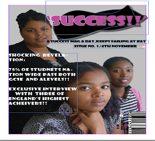
My magazine cover follows the conventions of a real magazine cover. However  I may have challenged the fact  that I have gone for a fairly simple design by only including a main cover line rather also including lots of  cover lines,I did this because I did not want to overcrowd  my photograph.


 Significantly,I have represented secondary school students aged 11-18 years old and teachers,this is mainly due to my photographs which depict this.My product also represents secondary schools students because I used dynamic funky font and in my contents have advertised and listed article topic that would be of interest to them.In addition,my product represents  ethnic minority social group since three black girls are featured on my front cover.On the contrary,my contents represents people of an array of different ethnicity's,there are photographs featured that show this. 
IPC media produces over 85 iconic media brands.There printing brands reach 2/3 of UK women and over 44% of UK men.This is almost 27million adults,with their on line brands collect 20million users every month.
Above all,I feel that IPC to distribute my  media product because it publishes a wide range of genres of magazine and also because it is widely distributed  in the UK which means that my magazine would reach a wide range of people increasing its audience.


My audience would be secondary school children  ranging from 11-19.I believe I have attracted my audience by including  pictures of  students  and in my contents page I also included topics that would generally interest people of this age.There is also a use of a bold colour theme that would stand out and attract my audience.
The price of the magazine is also very cheap enabling my audience to buy the magazine.


I learnt how to edit photographs on Adobe photo shop,for example I have learnt how to remove spots by using the spot plaster tool,I have learn how to use the clone tool in order to mask a flaw from the photograph,I learnt how to increase the vibrancy and photograph quality and crop images.I also learnt how to upload images to blogger.Furthermore,I also learnt how to add special effects to text  for example:shadow and the line thickness of the font.


Things to improve for my music magazine are to manage my time more carefully so that I can edit my pictures more precisely in order to make sure that the quality of my photographs is the best that it can be.I would also ensure that my contents page  would  also be properly aligned.I will also make sure to include more screen shots  in order  to  show more progression and development and ideas in my work.I will also do more sketches in order to make my research more succinct.Most importantly I will make sure that my music magazine research is more focused and that my ideas are coherent and are focused,and I will make sure that I carry my initial idea through so that I avoid wasting time.

Sunday, 13 November 2011

School Magazine Contents Page

Chosen contents page photographs:
Original photograph above and below photo -shopped  photograph,the image has been airbrushed and  quality and  colour has been improved.


Original photo above and below photo-shopped version.The photo has been cropped  and the  picture quality has  been improved.


Original photograph above and photo-shopped version below.I have cropped the photograph and improved  colour balance.


Above is the original photograph and below  is the phtoshopped version.I cropped the photo and improved vibrancy and picture quality.


Above is original photograph and below photo-shopped version,I have improved picture quality,colour balance and vibrancy. 


Above is the original photograph and below is the phtoshopped version.The photograph has been cropped,picture  quality and vibrancy has been enhanced.


Stage4:
I then added the captions below my image using a text box.
Stage5:
I then began to import the rest of my photographs and started completing my contents table.I used the stroke tool to thicken the frame of my contents table,photos and captions.


I  imported the pictures into InDesign by dragging them,from a saved file.


Stage 2 :


Stage 1:
Firstly I included a text box so that I could write  the editors letter.


Stage3:
I print screened my magazine cover,cropped it then shrunk it down and then imported it  on to my contents page.
I also created my contents table using the line tool and imported the largest photo.


This is the final page layout of my contents page.
Here is a close up view of  the bottom part of my contents page.
Here is a close up view of the top half of my contents page.
This is my final product.


School Magazine Cover Final Product


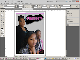
Firstly, I edited my photograph,by airbrushing and cropping it.


I transferred my photograph into InDesign  and  my masthead design.

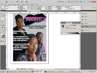
I then added the text needed for my selling line and my date and issue number.


I then added the text needed for my main cover line,copy and  paste a bar code.

My magazine desgin had now come together.


This is my final magazine cover design.


School Magazine Fonts

Initially  I was experimenting with a range of different fonts,sizes and colour.
I chose the font Showcard Gothic and decided to experiment with different ways in which I could present it.I chose to present my font as a speech bubble, simulating  the pupils saying that the magazine gives them success,but I thought that as a masthead it would overwhelm my magazine cover,I also didn't believe it was conveying the message of success.I then designed a range of dynamic angular shapes I now felt like these created the idea of succeeding.


I chose this to be my final masthead degin  beacuse, I feel that it is  bold,and  it conveys the message of success: acheiving,this is due to its dymanic and creative design .Above all , it would also stand out gainst my grey magazine cover.

Sunday, 6 November 2011

School Magazine Contents Page Photoshoot

I do not like this picture because the young boy in this photographs heads faced downwards causing him to look a little bit sleepy.
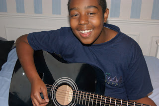
These pictures are supposed
to portray a young boy on a 
guitar.
I like this picture the boy seems to be enjoying playing the  guitar his face is positioned up[wards and he is directly facing the audience.


I don't  like this picture because  the  boy looks very static and wooden,causing the picture to look boring and dull.
These pictures are supposed to be portraying a student  fully engrossed and enjoying reading a book.
I do not like this photograph the girl has a plastic smile on her face and is not even  reading the book which causes her to seem as if she is uninterested.


I really like this picture the girl genuinely looks as if she is enjoying reading the book,of course her expression is slightly exaggerated but not so much so that it looks over the top or fake.

I do not like this picture because the girl has blank expression on her face making the photograph boring.
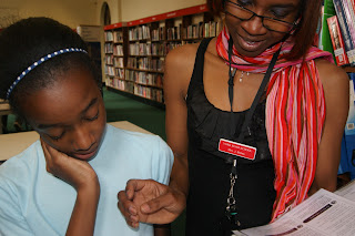
The following pictures are supposed to portray a student receiving help from a teacher.
I like this photograph it shows the student seeming to be genuinely happy  to receive help from  her teacher how ever  the photograph needs to be cropped in order  to get rid of unnecessary background distraction.


I do not like this photograph because the student has a blank express on her face causing her to seem as if she is uninterested or bored,which is not what I'm trying to portray.


In this photograph both the student and the teacher have blank expressions on their faces causing the photograph to become very dull.


I do not like this photograph because the student looks tired or almost bored,causing the photograph to fall flat.


The following photographs are supposed to portray a young student celebrating her achievement.


I don't like both this picture and the one above because her hands covering the medals so you can barely see them and in both pictures her heads held high and cocked to one side depicting that she is a bit over confident or cocky.


I really like this photograph because she has a big smile on her face, and you can actually see her medals.Furthermore, her hand is held out suggesting that she wants to share her achievement  with the rest of her school.Unfortunately she is not looking directly in to the camera which makes the photograph slightly disjointed.
I like this photograph  because you can clearly see that the student is happy with her achievement.

I like this photograph because the student looks very happy with her achievement but the fact that she is not looking  directly into the camera makes the photograph dis engaging.