
Sunday, 6 November 2011
Change in ideas!!

School magazine Cover Photoshoot take 2
 |
| I do not like this picture because everyone in it is looking at a laptop in a very un-animated way making the picture very boring,there is also some books that are brought to the fore front of the photograph,unfortunately drawing attention way from the people in it. |
 |
| I don't like this picture because everyone in it is cut off in this frame ,and I think it looks ridiculous. |
 |
| I really like this picture because everyone in it is looking directly in to the camera which makes the picture engaging,and interesting.I have decided to use this picture for my magazine cover. |
 |
| Above is a sketch of my magazine cover,this shows where I will position every thing when producing the final product. |
Monday, 10 October 2011
School Magazine Contents Page Reserach

I like the layout of this contents,it is horizontal rather than vertical.There is an editors letter,featured on this contents,which is a feature that has not been featured on the other contents pages.The image on the top of the page is huge in comparison to other photographs on the page to emphasize that it is the main article.There are other pictures present that are small in comparison to emphasize that they are insignificant articles in comparison.There is also a colour scheme or red,white and black and yellow which uses a wider range of colours in comparison to the other contents pages I have looked at.

I like the layout of this contents,it is horizontal rather than vertical.There is an editors letter,featured on this contents,which is a feature that has not been featured on the other contents pages.The image on the top of the page is huge in comparison to other photographs on the page to emphasize that it is the main article.There are other pictures present that are small in comparison to emphasize that they are insignificant articles in comparison.There is also a colour scheme or red,white and black and yellow which uses a wider range of colours in comparison to the other contents pages I have looked at.
 This contents page has both a horizontal and a vertical format.The colour scheme is red,white and blue.There are only two pictures featured in this contents page,the first picture featured on the top of the page is very large to emphasise that this the main feature of the magazine.The other photograph present is much smaller in order to demonstrate that the feature is of less significance.The contents table is fairly long in order because there is a lack of pictures featured. |
 | ||
This contents page is very bland and bare the colour scheme is simple with red and black being the only colours present all of the pages featured are numbered which doesn't allow the reader to know what to focus on.
|
Sunday, 2 October 2011
School Magazine Photoshoot
 |
| I think that the large computer, draws attention from the people in the photograph.The distractions in the background make the photograph look slightly cluttered and busy.There needs to be a dress code put in place,so that the people look like they relate to one another, therefore fitting in with my theme of ethnic unity.I think in future I will make sure everyone wears different coloured t-shirts,this will highlight the message I am trying to convey,and it will also contrast with the dark colours in the background making the people sand out.At the moment,everyone is wearing dark colours and are in a sense blending in to the background.The camera is also slightly out of focus,so in order to improve this I would hold the camera steadier,set the camera on a tripod or use a better camera. |
 |
| I do not like this photograph at all there is not enough light present in the shot therefore causing there to be no real sense of definition on the people's facial features.The fact the girl has her hair covering her face,makes the photograph look really awkward because you can't fully see who she is.The text book they are reading needs some light reflected away from it,because it has become, too shiny and overly bright.I could improve the lighting quality by holding a sheet of white paper just besides each of there faces in order to reflect enough so that every one and everything is clearly seen. |
 |
| I used camera flash in the photograph causing the photograph be to bright and shiny and blurry,instead I could of incorporated natural light,by taking the photograph in an area in the library that was well lit. |
 |
| This photograph is unclear and out of focus,there is not enough presence of light and the computer in far too large taking the glory away from the people in the photograph. |
 |
| Again there is poor lighting quality,the composition I believe is not very good and the people do not actually seem to be reading the book but instead staring mindlessly at it,so I need some more interaction present with the props to make the photograph come across as believable. |
 |
| The camera has zoomed too far out,so that you can just about make out the image of the people,it also makes it difficult to know what to focus on,as there are too many background distractions are present. |
 |
| I know this photograph is not amazingly brilliant,but with this photograph,I am beginning to see some thought behind it.The composition is more organised,there is a glimmer of decent lighting present;this could be improved as I mentioned before,if the people were wearing bright colours this would help them to stand out and I could also make use of the natural light present in the room. I also need to mix up the arrangement of the people,the mixed raced girl and the white boy are positioned together as are the two black kids.Evidently,I need to mix up the composition so it at least looks like there is more racial diversity, present.I could also improve the focus of my photograph. |
Wednesday, 28 September 2011
School Magazine Cover Photograph Research


These pictures are more cliche they show three white people and a black person whereas the magazine I liked before shows all the races and their skills and creativity achieving whereas this once they are smiley indicating the photograph to be really staged and false with the end photograph of them laughing on queue. The magazine before celebrates multi-cultural diversity and working together in order to achieve.From these photos you get a sense of community, of people working together,helping one another achieve,which is a message,I also wish to translate.
I like these compositions I think they would be the most appropriate for my magazine cover, there is no negative space on the photograph; because the space available could easily be utilised and if the text was to come on the fore front of the photo it wouldn’t ruin the composition but harmoniously tie in. I feel that one of these compositions would be the most appropriate for the front page of my magazine. I am going to base all of my pictures on these three compositions and my final decision will be based on the composition that I can deliver the most practically. The only difference I will make is that the people I will incorporate, will be real they will not be fake, with plastic smiles plaster on their faces and I will try to incorporate more ethnic diversity.
 |
| This is a roughly sketched version of my magazine cover,there are three versions which are based on the compositions on the photographs above,the final outcome is based upon which composition I deliver the best practically. |
Below is further photographic research,that led me to the conclusion above:

This picture is more natural it demonstrates cultural diversity and students achieving UN like the other photos it is photographed while in action a freeze frame, but it goes back to reality since the shot is not posed and pristine but the people look more real rather than perfect models like the three photographs before.

I do not particularly like the composition of the picture, you can tell by the quality of the photograph and the random composition of the students sitting down that it is an amateur photograph, what I do like about this photograph is that the people look real, they do not translate as fake, which is the kind of people that I wish to incorporate on my magazine cover. However this picture does not convey achievement.

This picture shows a wide range of diversity but I do not get a sense of achievement from this photograph, what I do like from this picture though is the fact that they are all facing directly at the camera.

I do not like this picture because I do not think the composition is very good the people are standing in a long line and this wouldn’t work on a, magazine cover purely because of the width, and if the image was to be stretched out onto A4 portrait on a magazine cover, the people would look warped and abnormally stretched out. Also I don’t think the photograph would make my magazine stand out, as different.
Monday, 26 September 2011
School Magazine Cover Research


Here is an example of random school magazine that I found, this was the initial research. The front shows a picture of a student playing guitar, perhaps this magazine is in behalf of a performing arts school.

This magazine cover portrays a teacher in an underprivileged school. This magazine cover, I found sparked my interest in promoting academic achievement amongst ethnically diverse pupils from all walks of life.
I like this magazine because I feel that it portrays a very positive message about their school. The photograph depicts people of all nationalities, backgrounds and ways of life; what really stands out is the fact that they all have objects in their hands showing that they have aspirations and because they are all standing beside one another giving a sense of communion and achievement which thrusts positivity to a society where racial tension and stereotypes of such achieving.

When the image is flipped horizontally the people are directly facing the audience whereas when the photograph in its original form it is awkward since the people seem as if they are looking through the audience rather than looking directly at them. Also at the left hand side suddenly every individual in the photograph is important, whereas in the intial cover the boy at the end is made to seem insignificant.
Homework task:How are teenagers perceived in the media?
The photographs I have taken may bee seen as extreme,but they are stereotpical ideas of how teenagers are portrayed as:
 |
| the main, and sometimes only offenders of knife crime, |
 |
| thugs and yobs, |
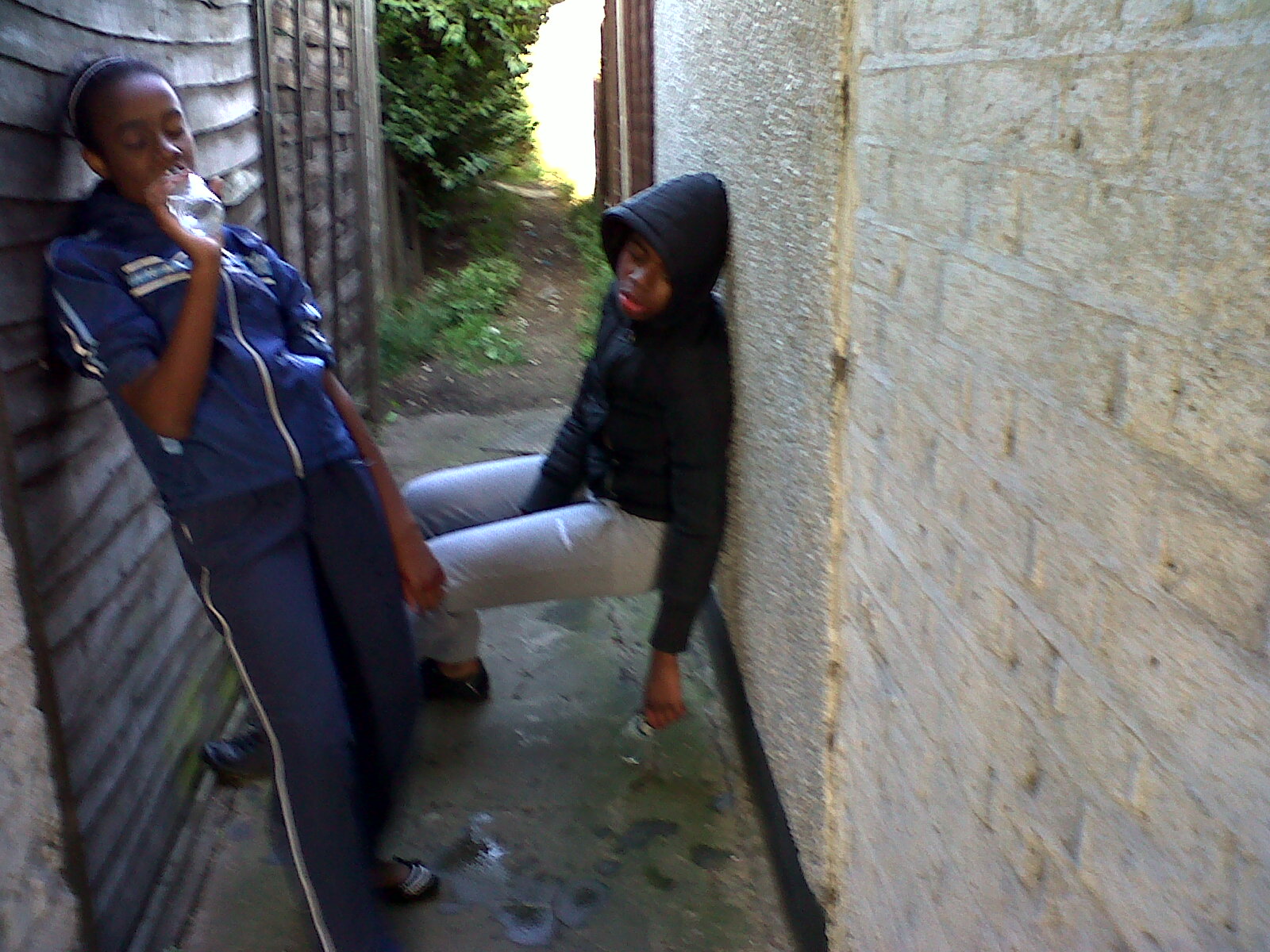 |
| and drunks. These exaggerated phtotographs depict how eaxaggerated and warped the ideas of the media can be,the media simply portrays an idea,a photograpgh,an article etc and it instant prompts the audience to beleive that their ideas are always truth. |
Subscribe to:
Posts (Atom)