 |
| Un-airbrushed photograph |
 |
| Airbrushed photograph |
 |
| Original photograph-un airbrushed |
 |
Airbrushed version        |
|
| Un-airbrushed photograph |
|
| Airbrushed photograph |
|
| Original photograph-un airbrushed |
|
| Airbrushed version |

 |
| I have combined both of my original ideas and have come to the decision that I want to use this as the basis for my final double page spread layout. |
 |
| I need to tighten up the alignment of my of the page numbers in my contents table and the features below the contents page like the page number,the magazines website and the date.I also need to increase the display performance of my photographs because on in-design this is automatically lowered when a photograph is imported.I also need to justify the text featured in the contents page. |
 |


 |
| Take1 pose1 |
 |
| Take 2 pose 1 |
 |
| Take3 pose 1 |
 |
| Take 4 pose 1 |
 |
| Take 5 pose 1 |
|
| Take 6 pose 1 |
|
| Photograph research/inspiration I have chosen to use take 6 pose 1.I have chosen this photograph because I feel that my model here radiates confidence sass and style. |
Photograph research/inspiration  |
| This photograph is to be used as the main photograph on the contents page the same model is used which relates to the magazine cover,therefore relating to main article.The model's styling(hair,clothes and makeup) definitely relates to my research. |
  Photograph research/inspiration(for my photograph below) Photograph research/inspiration(for my photograph below)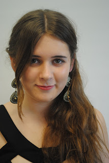 |
| This photograph is to be featured in my contents table as the highlighted feature article. |
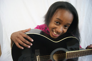  Photograph research/inspiration(to the right) Photograph research/inspiration(to the right) |
| This photograph is to be featured beneath the main article photograph and is going to be the second largest photograph on the page. |
 |
| This is a sketch of my final contents page design that I will use. |

