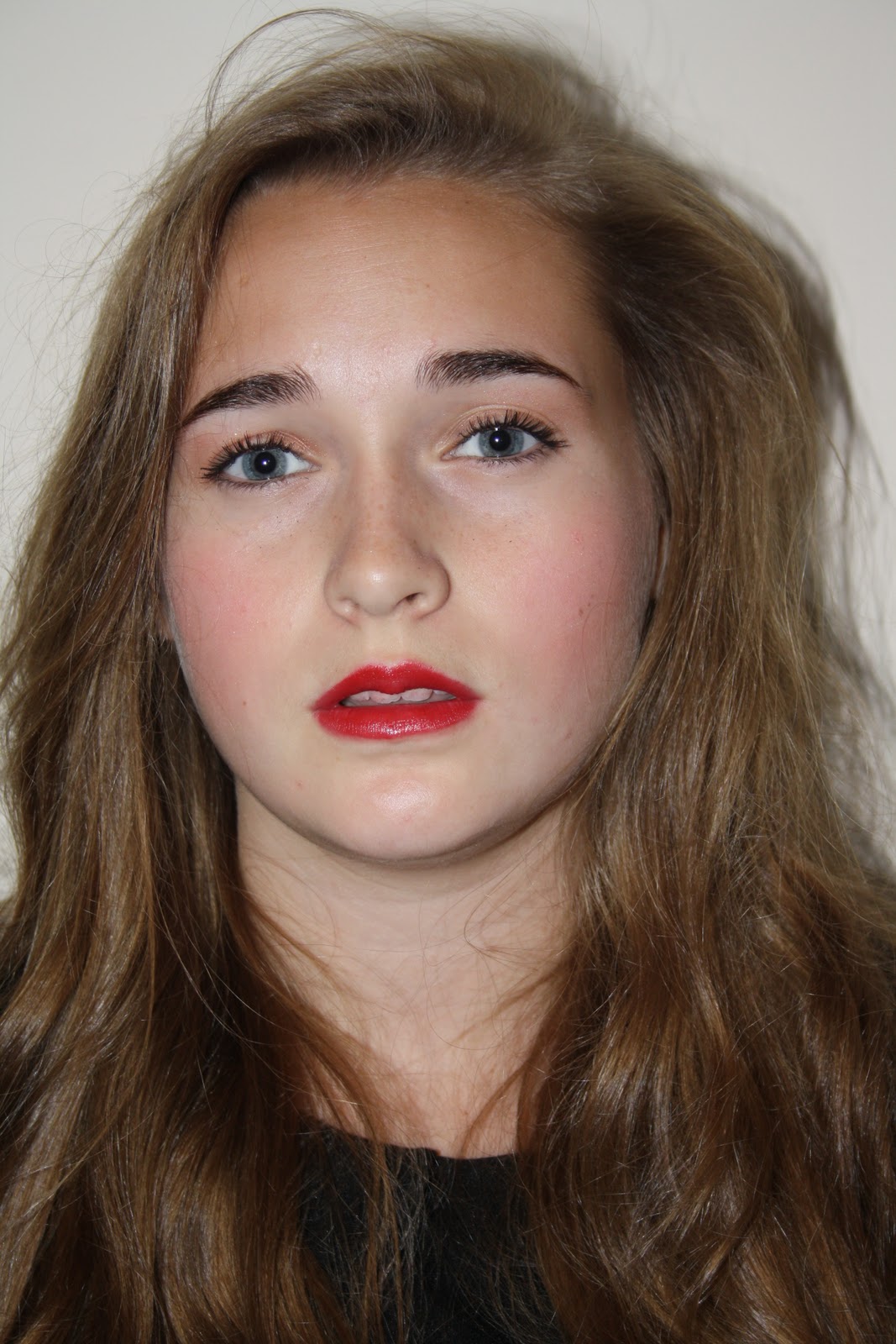
Looking back I have realised that I have made my magazine cover outside the margin guide lines and now I have to re-size the magazine cover so that all my magazine cover can be seen,I also need to make sure that all all the cover lines are in line I also need to improve the display performance of my photograph because it loses picture quality when it is imported in to adobe In Design.
Monday, 5 March 2012
Monday, 20 February 2012
Font research
I have chosen to use this font idea for the masthead of my magazine cover because I feel that its dynamic bold and yet elegant and girly.
Front cover preperation
Exact magazine plan above.The design choices I have made are all based on information I have gained from research.
Sunday, 5 February 2012
Masthead research

The masthead for 'Vibe' magazine is bold and the fact that every other letter is upper case adds to the boldness of the typeface.The colour black is used which again adds to the boldness of the font and the spacing between each letter defines the letter and increases the impact of the masthead.The font again is a sans serif.The simplicity of the font makes the masthead clear and easy to read and allows the name of the magazine to easily stick into the reader's mind.
![]() |
| Q magazine's masthead has a bright red background which allows it to be bold and clear the letter Q stands out against the already bright red since it is white which enables it to bold,dimension is added with the use of inner and outer shadow used around the letter Q.The font is sans serif as the serif has a swift flick.The 'Q' is also italic as it is angled forward.All the extra properties that have been given to this typeface makes it aesthetically pleasing and easy to identify or to associate with when referring to 'Q' magazine. |
The 'RollingStone' masthead uses the same colours as 'Q' magazine but there use is opposite.The typeface is bright red which increases the vibrancy of the masthead,which enables it to stand out and helps it to stand a lot of energy is also conveyed by this logo since there is also the use of inner and outer shadow,the font is also framed with white which makes the red appear more pronounced,the font is also really elevated since the use of drop shadow gives it a 3D effect.The font also has a unique look since it is a serif font,at the beginning and the end of each masthead the serif elongates,coils and then flicks.
The 'NME' masthead once gain uses the colour red,the hue is much more vibrant than any other shade of red that has been used in the mast heads I have looked at previously.The colour makes the masthead clearly stand out as it looks as if it practically radiates energy.White is encased around the font which compliments the dynamic shade of red and the black outline enhanced around the white.The magazine title is an abbreviation,what the abbreviation stands for is featured beneath the logo itself so then when people see the masthead they are instantly able to recognise the type of magazine that they are about to tread.The fact that the masthead is abbreviated makes the masthead straight to the point,rather than long and drawn out,therefore increasing the impact of the masthead,the font is sans serif and each letter has a thick and wide stem with causes the font to have strength.
The masthead for 'Vibe' magazine is bold and the fact that every other letter is upper case adds to the boldness of the typeface.The colour black is used which again adds to the boldness of the font and the spacing between each letter defines the letter and increases the impact of the masthead.The font again is a sans serif.The simplicity of the font makes the masthead clear and easy to read and allows the name of the magazine to easily stick into the reader's mind.
What I have learnt from this masthead research:
- My font must be bold and dynamic.
- My font masthead title must be audience grabbing it is design,in its name and it must be clear and eay to read.
- The title of my magazine must be 'short and sweet' in order to create impact and presence.
Final front cover photoshoot
Ways that I improved my photographs:
- I took a lot of photographs as you can see from the screen shots below so that I could make slight improvements,I got closer, further away and chose different perspectives and further evolved the same pose this enabled me to get stronger photographs because I was more focused and able to make more conscious decisions each time when considering how to make a pose or composition stronger; taking a vast amount of photographs evidently meant that I had a lot more photographs to choose from, increasing my chances of getting a really good photograph.
- I was not able to get a tripod which would have been very ideal in order to take a more focused photograph but instead I increased the shutter speed on the camera so that I was given more time in order to hold my hand steadily at each shot decreasing the blurriness of the photograph.
- Increasing the shutter speed also played a vital role in improving the lighting of my photographs,the increased shutter speed time, increased the amount of time the camera lens was exposed to light,the more light that was let into my camera meant that my photographs were brighter.
- I took the photographs in a photo studio set up,this improved the quality of my photographs because the studio lights were diffused light rather than fluorescent light this meant that harsh shadows were reduced and the flash was also not used which meant that the colour and details of my photographs were not reduced.This good quality studio light also enabled me to add just he right maount of light against my model's face since I was able to position the lighting systems just near enough to her face without getting orange and grainy photographs.
![]() |
| Print screen part1-shows the shear volume of photographs I have carefully taken. |
![]() |
| Print screen part2-shows the shear volume of photographs I have carefully taken. |
| Take1 |
| Take2 |
| Take3 |
| Take4 |
| Take5 |
Third photo shoot
I attempted to improve my improve my photographs:
- using various different methods in order to improve my lighting.
- by paying closer attention to styling and I therefore took more time in doing my models hair and makeup.
| Take1 |
| Take2 |
![]() |
| With take 1 and 2 I used natural light by opening windows and I also used a D.I.Y technique of improving lighting called bounce card;see the picture above. This technique enabled me to use flash in a way that was a little more sophisticated.Light was able to bounce off the ceiling while also diffusing the light going forward this enabled me to get a less harsh flash effect that many flashes leave images with. Basically light was pushed out from the flash in two directions which lead to a more even light rather than just diffusing it.However the lighting still looks a little dull and I believe still needs to be improved. |
| Take3 |
| Take4 |
| Take5 |
| Take6 |
| Take7 |
| Take8 |
Saturday, 4 February 2012
Second photoshoot
I attempted to improve my photographs by:
- putting the Sony SLR digital l camera on spot focus mode. Spot focus mode gave me the ability to produce a clear and more precise photograph of my model Ellis.
- holding the camera closer to the model which enabled me to hold the camera sturdier because I spent less time trying to precisely focus the camera on my model Ellis.
- taking the photograph of my model against; against a white wall,the color white reflects back most of the light it receives.
| Take3 I do not like this photograph because I used a close up and you can not see my models shoulders which causes the picture in my opinion to look slightly dis jointed. |
Subscribe to:
Posts (Atom)