Sunday, 5 February 2012

Final front cover photoshoot


Ways that I improved my photographs:
  • I took a lot of photographs as you can see from the  screen shots below so that I could make slight improvements,I got closer, further away and chose different perspectives and further evolved  the same pose this enabled me to get stronger photographs because I was more focused and able to make more conscious decisions each time when considering  how to make a pose or composition stronger; taking a vast amount of photographs evidently meant that I had a lot more photographs to choose from, increasing my chances of getting a really  good photograph.
  • I was not able to get a tripod which would have been very ideal in order to take a more focused photograph but instead I increased the shutter speed on the camera so that I was given more time in order to hold my hand steadily at each shot decreasing the blurriness of the photograph.
  •  Increasing the shutter speed also played a vital role in improving the lighting of my photographs,the increased shutter speed time, increased the amount of time the camera lens was exposed to light,the more light that was let into my camera meant that my photographs were brighter.
  • I took the photographs in a photo studio set up,this improved the quality of my photographs because the studio lights were diffused light rather than fluorescent light this meant that harsh shadows were reduced and  the flash was also not used which meant that the colour and details of my photographs were not reduced.This good quality studio light also enabled me to add  just he right maount of light against my model's face since I was able to position the lighting systems just near enough to her face without getting orange  and grainy photographs.

Print screen part1-shows the shear volume of photographs I have carefully taken.

Print screen part2-shows the shear volume of photographs I have carefully taken.

Take1
Take2


Take3
Take4
Take5
Take6


I have chosen to use Take 4 for my magazine cover because I believe the picture has the strongest composition and styling as my research photograph  below I believe that it conveys the poppy/sleek style that I want for my magazine cover.
 
 
Below is a drawing plan of the layout of my final magazine design,which is based upon my research, inspiration of the layout  of my front cover above.
 
This  rough drawing is the final layout that I want for my magazine cover.

Third photo shoot


I attempted to improve my improve my photographs:
  • using various different methods in order to improve my lighting.
  • by paying closer attention to styling and I therefore took more time in doing my models hair and makeup.


Take1
Take2

With take 1 and 2  I used natural light  by opening windows and  I also used a D.I.Y technique of improving lighting called bounce card;see the picture above. This technique enabled me to use flash in a way that was a little more sophisticated.Light was able  to bounce  off the ceiling while also diffusing the light going forward  this enabled me to get a less harsh flash effect that many flashes leave images with.  Basically light was  pushed out from the flash in two directions which  lead to a more even light rather than just diffusing it.However the lighting still looks a little dull and I believe still needs to be improved.
Take3
Take4
Take5
Take6
Take7
Take8
Take9
With take3-9 I attempted to further improve the lighting by shining the ceiling lights that were overhead attached to the ceiling facing my model Ellis,direction I wanted more light to hit her face and the result was a set of  orange photographs that consisted of heavy shadow featured underneath my models eyes.
I think the orange photographs were due to the combination of the frequency of the light flicker from the lights  fighting against  the camera shutter speed.  The  overhead fluorescent lighting, therefore caused some photographs to have an orange cast.


What i further ways that I  can improve my photographs for my final photo shoot:


  • I can make my photographs more precise and I can improve the focus of my photographs
  • I can also improve the lighting
  • I like the compositions that I have created but I can believe I can further improve that therefore enabling me  to get stronger poses from my model because I am now a lot clearer about the   vision that I want to create so I will be able to give my model clearer instruction of what she needs to do in front of the camera

Saturday, 4 February 2012

Second photoshoot

I attempted to improve my photographs by:
  • putting  the Sony SLR digital l camera on  spot focus mode.  Spot focus mode  gave me the ability to produce a clear and more precise photograph of my model Ellis.
  • holding  the camera closer to the model which enabled me to hold the camera sturdier because I spent less time trying to precisely focus the camera on my model Ellis.
  • taking the photograph of my model against; against a white wall,the color white reflects back most of the light it receives.

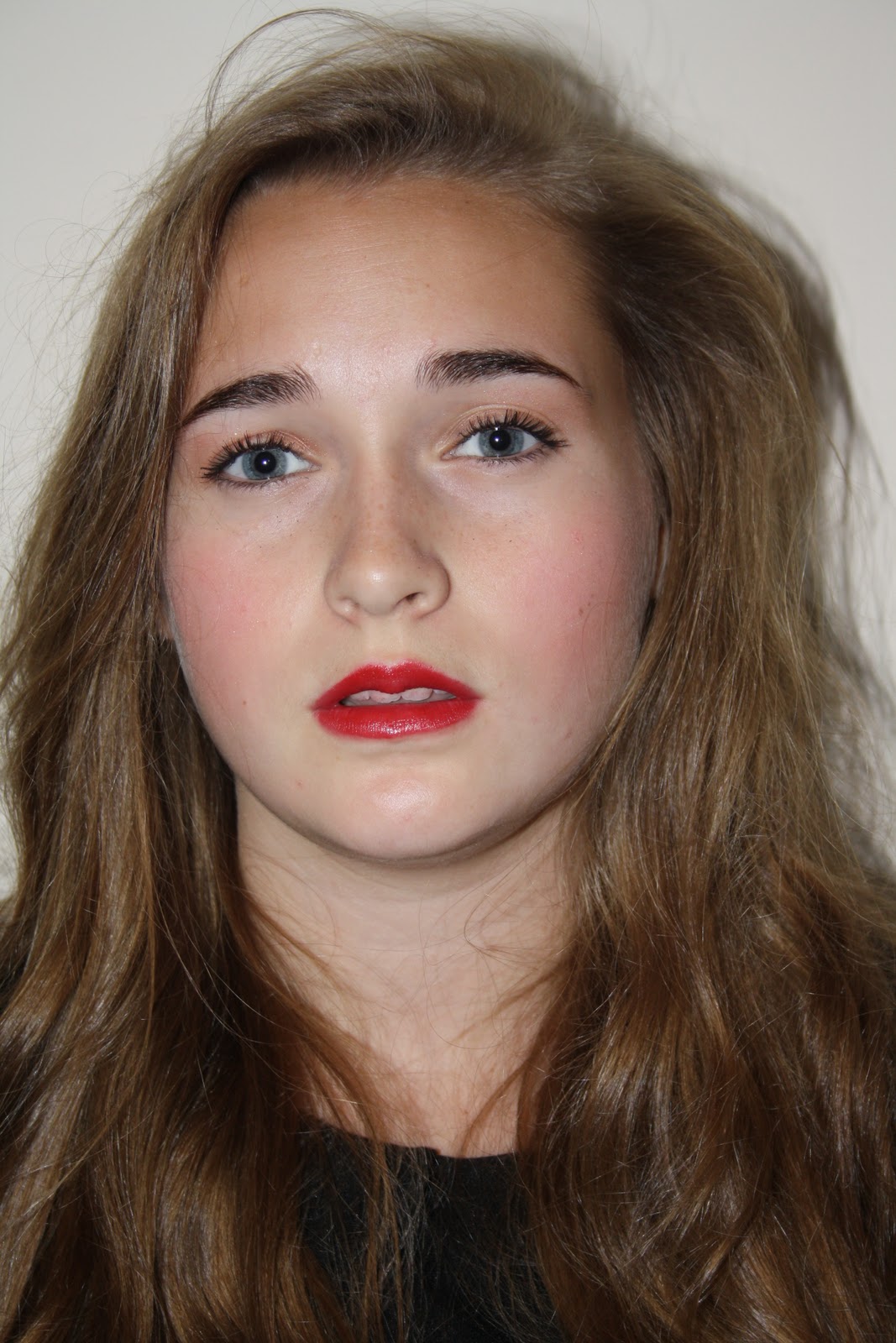
Take1
I don't like this photograph because I think that
my model looks as if she is stunned by something running than looking sophisticated and alluring.I also like this composition because there is enough room in order  to put all the necessary features in order to complete my magazine cover without  cluttering and ruining the photograph.

Take2
I do not like this photograph because  I think the composition of it is awkward,her head is slightly titled  to the left and because the photograph is taken quite close up and her hair covers her shoulders her shoulders look hunched,the models mouth is also turned down which  makes her look like shes uncomfortable  and scared,and personally I do not feel this picture would truly represent the poppy yet sleek image that I'm trying to convey for my magazine. 
Take3
I do not like this photograph because I used  a close up and you can not see my models shoulders which causes the picture in my opinion to look slightly dis jointed.
Take4
I do not like  this photograph because my model looks as if she stunned and has suddenly been caught of guard.I also think that the fact that her body is positioned side wards makes her look very awkward and it makes her pose look uncomfortable and too over thought about and staged to the extent that as an onlooker looking at the picture I fell slightly awkward looking at it.

Things to improve fort he next photo shoot:


  • I will make the make up my subtle so that it looks more trendy and sophisticated;because looking back at  my photographs the red lipstick does not  suit my models complexion because it stands out to the extent  that it draws attention away from her face.
  • By looking at my research,also I  can also  see that I need to improve the lighting by mainly increasing the amount of light that hits her face.I want the photograph of my model to be bold and basically jump off my magazine cover
  • I also wish to improve the composition of my photograph,and the focus of my photographs.


Thursday, 2 February 2012

First photo shoot with detailed research and preliminary research


Take 1-pose1
I am  currently not too sure  what I want   the layout  of magazine cover to be nor do I know what pose I am going to use  for  the main photograph of my front cover,so in order to come up with a conclusion to what that is going to be I have taken some initial photos and have related  them to research and I have also used  preliminary drawings that will act as a visual aid in order  to help me make a final decision. 

Take 2-pose1
This photograph is based on and inspired by the following research featured below.I like the composition for this photograph,my model Ellis is centered directly in the middle,this would provide me with enough space so that I can add the features needed in order to make my magazine cover complete.However,both the photograph above and this one are  slightly  out of focus and the lighting here clearly needs to be improved.There is a significant difference between the photograph above and  this one.In the first picture  the models eyes are opened wider and the composition of the photograph is slightly  off center.

Both of these photographs have inspired the styling and the composition of both of the photographs above.


To the right you can see my preliminary drawings  that are based on the photographs that I have taken above.

Take 1-pose2

Take 2-pose2


Take 3-pose2
I do not particularly like the composition of my model facing the right hand of the page,I think this looks awkward and if I was to add  the extra features that were needed for my magazine front cover to look complete my magazine front cover would look  over crowded and busy.The lighting in this  photograph is also very poor and  there is too much shadow in each photograph.

Take1-pose3


Take1-pose3
I do not like these photographs  because in this picture my model is suppose to look alluring and seductive and instead she looks uncomfortable and disconnected.The lighting again needs improving.

The composition of the pose,the makeup and the clothes my model is wearing in the in all the takes within pose 2 and 3 above were inspired by this  magazine front cover.
This preliminary sketch just portrays what the magazine cover would look like if I was to use the picture of my model posing sidewards.


Take 1-pose4

Take 2-pose4

I really do not like these pictures the composition I believe doesn't not flow it looks very robotic,my model is positioned in the centre of the magazine and takes up the whole page,I think it s look a bit weird because her posture is slightly hunched  and as it appears in both takes of this shot that her face is too close to the camera.Both takes are also really out of focus and the lighting is not very good.I also don to like this photograph because with the headband in my models hair  this makes her look like a hippy which is a look which contrasts with the sleek and sophisticated style that I want for my magazine.


Pose 4 was inspired  by this photograph.

This preliminary sketch indicates the layout of my magazine if I was to use the two photographs above.


Take1-pose5
I do not like this  photograph because I feel that it looks to sultry and seductive with my model's hair draped over her face,he head crooked to the side,her eyes at a squint and her lips pursed.The lighting for this photograph is also quite bad and needs to be improved.The shadow at the side of her body is too much and the photograph is slightly out of focus.


This photograph inspired the pose 4 above.
This  preliminary drawing depicts what the layout of my magazine cover would be if I used pose 4 above.


What I have learnt from my first photo-shoot:
  • The lighting needs to be improved
  • The steadiness of the camera needs to be improved I can do this by placing the camera on a tripod
I have decided to further develop take1 and 2 pose 1.




Wednesday, 1 February 2012

Music Magazine Mood Board


I have chosen to incorporate a picture of Marilyn Monroe and a picture of an addtional  stylish woman in order to indicate that I want my magazine to have a sleek and fresh  look. I also  have pictures of  pink bubble-gum, rainbows,ice cream and flowers and  basically things that I believe are stereotypically associated with femininity.This mood board,I believe truly explains that I want my magazine to be specifically aimed at a variety of  different women ranging from 15+;  I have also  included a picture of  women of all shapes and sizes to emphasise this.I have pictures of musical notes,instruments  and mics to indicate that I want the models that I use in my magazine to look like glamorous  singer/ songwriters and talented musicians.

Monday, 30 January 2012

Specific front cover research


I want a magazine cover  that conveys  a  girly poppy vibe and I have now decided to focus on  looking at magazine covers that have  a sleek and sophisticated design, that also  features  a female singer on the front cover because my model evidently fits this description:


I chose to focus magazine covers that featured the singer Adele in particular  because she is curvy, has big hair and can convey the same amount of sass and style that I want on my magazine cover this is how I believe that  the singer relates  to the model that I am going to use  for my own magazine cover. In addition, I also  like the layout  of the first two magazine covers and the pose of both of the photographs used so I will base these ideas toward  my initial  photo-shoot on both of these ideas and develop further from there.


Monday, 16 January 2012

Initial magazine cover research

I will be looking at different types of music magazine  in order to give me an idea in what direction I am going in when producing my own:


What I have learnt  from this magazine research(my conclusion):
  • The masthead must be bold and eye catching an positioned at the top of my magazine cover.
  • There has to be a strict colour scheme used on my front page so that my magazine cover looks organised and well designed, the colours have to link with all aspects of my front cover design.
  • The bar code needs to be  positioned  at the bottom of the page horizontally.The date and  the time also needs to be  positioned on the top of the bar code.
  • The colours that are generally used on magazine covers are red,black and white.
  • The design of my magazine must relate to the genre of music that I'm trying to convey and the target audience that I'm trying to relate to.
  • The photograph must be the prominent part  of my magazine cover  and must take up a majority of the page .
  • A limited use of fonts must be used for my cover lines and the font that are used must be clear and easy to read .
  • The cover lines must not consume the photograph used.Instead only a few cover lines   or none should overlap the photograph.
  • A model credit must be used.
  • Amain cover line must be  used.
  •  I should not  over complicate  my magazine design .
  • The main photograph can cover some or part of the masthead but the photograph should not hide the masthead.